UW Maps
Personal Project, 2024
Overview
Did this as a solo project at home during a coop term, mostly to practice my software-product muscles and eventually launch an MVP. The goal was simple: build a better map for the University of Waterloo campus that actually understood how students navigate it.
I ran the full UX process end-to-end. User research, ideation, low- and high-fidelity prototypes, and a complete design system.
✨ 001 // Background & Problem
As a first-year student entering university, I anticipated encountering various challenges, but one unexpected hurdle was the complexity of navigating Waterloo's sprawling campus.
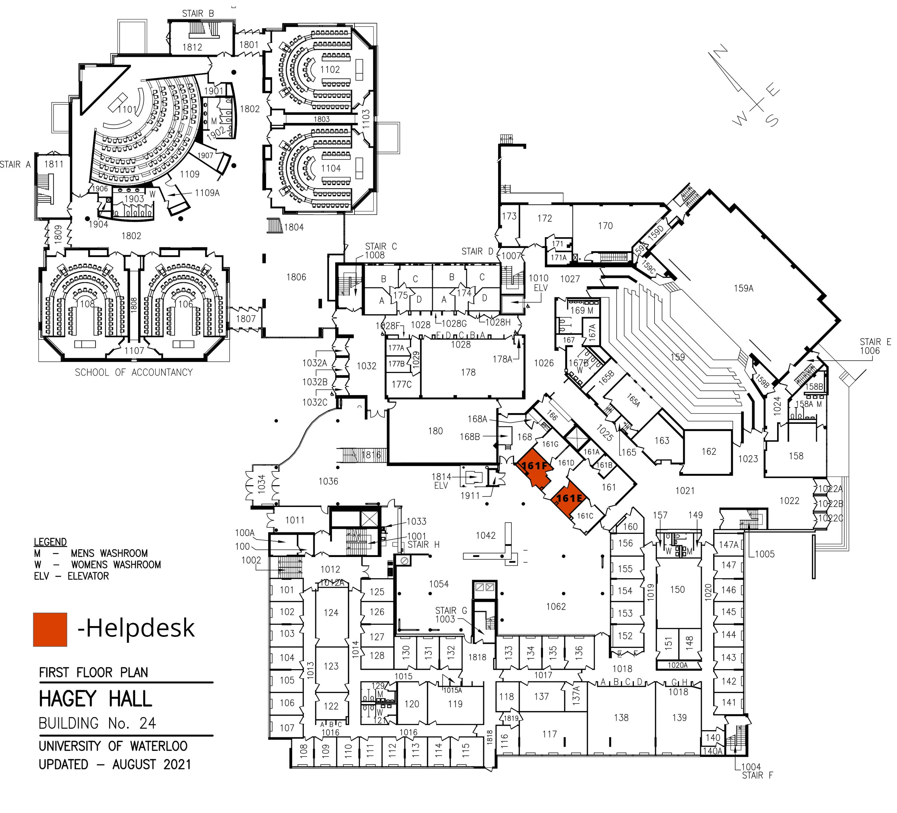
With its maze-like paths and confusing building layouts, the University of Waterloo presented a daunting challenge for newcomers like myself. Adding to the confusion were navigation apps like Google Maps, which often provided misleading building markers and lacked comprehensive reviews of campus amenities. These apps also failed to alert users to accessibility issues in study areas.

✨ 002 // Research & Ideation
I had two main questions I wanted answers to with my user research:
How big is the navigation problem?
What features should be prioritized given users' needs?
To figure out the answers to both of these, I decided to conduct research in a
Three-Pronged Approach:

Identifying the Problem
Quantitative
35
Participants

Identifying Specific Challenges
Qualitative
6
Participants

Ranking the Features
Quantitative
28
Participants
Identifying the Problem
The reason behind conducting this early quantitative study is to measure the extent of the issue and determine its significance. By opting for a quantitative approach, I was able to reach a larger sample size, providing more conclusive and confident data.
Given the resources available to you, how confident are you in your ability to navigate around campus effectively?
Very Confident, Somewhat Confident, Neutral, Somewhat Unconfident, Not Confident
During first semester, how many times have you been late to a class, meeting, or event because you couldn't find the location on campus?
At least once
Would you consider using an app that provides readily available navigation information, including floor plans and recommended study spots?
77% said yes
Do you believe it would be better and easier for you than existing options?
92% said yes

During their first year, the majority of individuals relied on asking their friends for navigation assistance.
Identifying Specific Problems
With the problem having now been validated as a real problem, I then conducted 6 moderated interviews/coffee chats with students who fit my persona. I had one simple question...
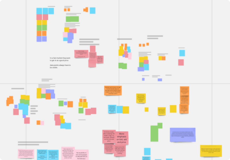
Considering the resources available to you right now, what features would you desire on the app to enhance your campus experience?
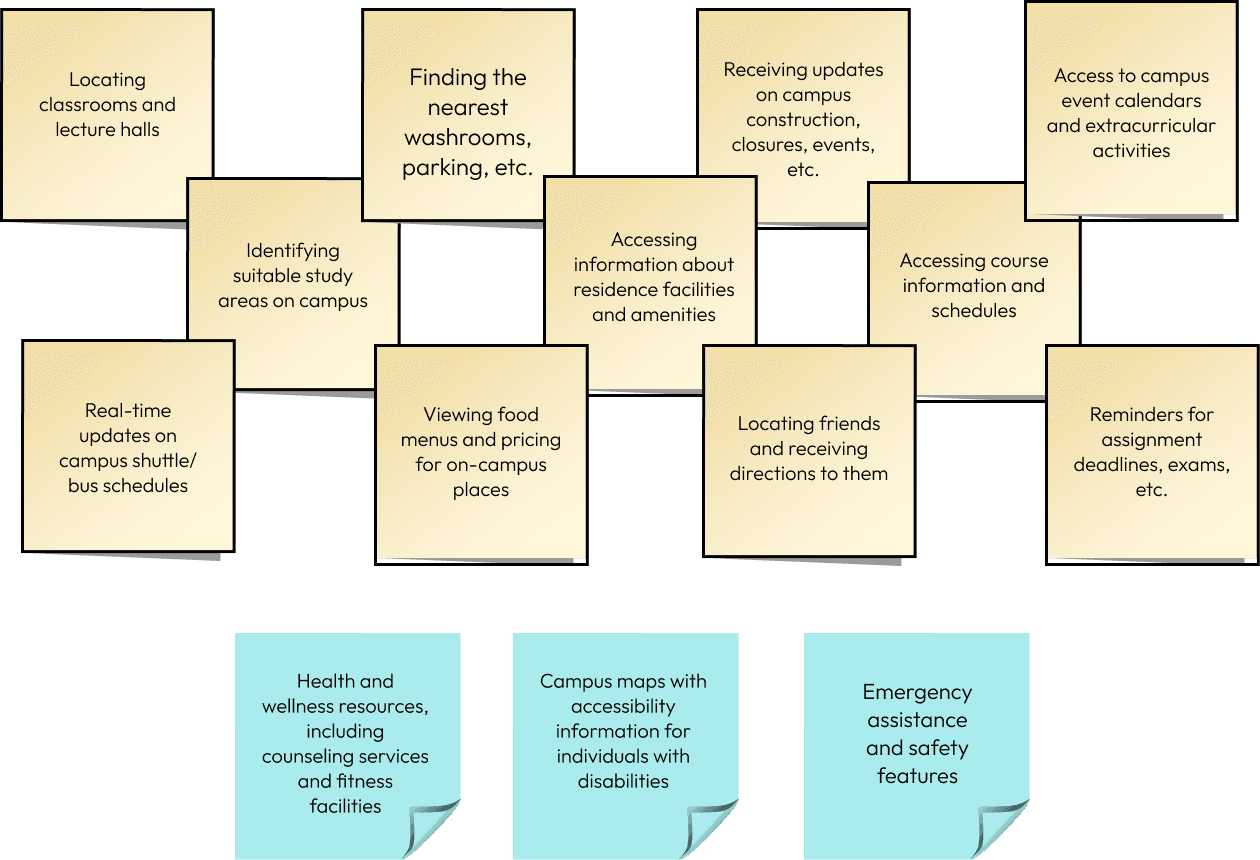
I took notes of all the features people brought up on a Miro board and created an affinity map of common themes. Here are all the features participants mentioned at least twice:
Ranking Potential Features
My last study had participants rank features they would want. I had a google form set up which had participants rank each of the above stickies 1–11. First place would get 11 points, second place 10 points, third 9 points, and so on.
Worth noting that accessibility features (on the blue sticky notes) were disregarded from the ranking process. They are essential regardless of participant preferences.
Here are the results:
1
Finding classrooms and lecture halls for classes
2
Identifying suitable study areas on campus
3
Receiving updates on campus construction, closures, events, etc.
4
Finding what on campus is open late (food, buildings, etc.)

Competitive Analysis
It is very important to see what is already out there to check if similar services already exist in the market. Studying existing solutions can also provide valuable inspiration for the design journey.
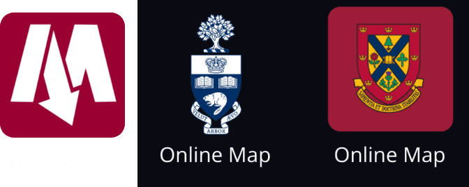
The Waterloo online map, the sole option for personalized campus navigation, falls significantly short when measured against the interactive maps offered by other universities. For example, here is our map compared to Queen's.
Similar services in other universities offer a lot of different USPs to incorporate into our own design (e.g. MacQuest's floor navigation!).
✨ 003 // The Designing Process
The first step was to develop a design system, a crucial step for maintaining consistency and establishing a cohesive theme throughout the application. This system provides clear guidelines on colors, components, and fonts, ensuring a unified vision across the project.
Design System and Brand Creation
In selecting the primary colors for my app, I opted for white, blue, and red. Blue, being a calming and universally recognized color often associated with navigation, aligns perfectly with the app's purpose. During designing, I will make sure to adhere to the 60/30/10 rule (60% primary, 30% secondary, 10% tertiary), which ensures a balanced and visually appealing design.
Colours

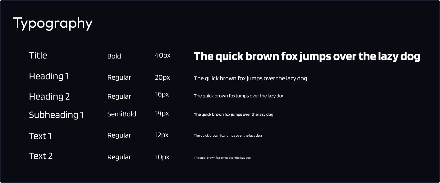
I chose the Blinker font for its modern and clean aesthetic, which gives off a sense of friendliness that aligns well with the overall tone I am aiming for.
Logo and Name
The logos needed to be simplistic to ensure they could be scaled down without losing their recognizability. After a couple of iterations, these are what I ended up going with:

Information Architecture
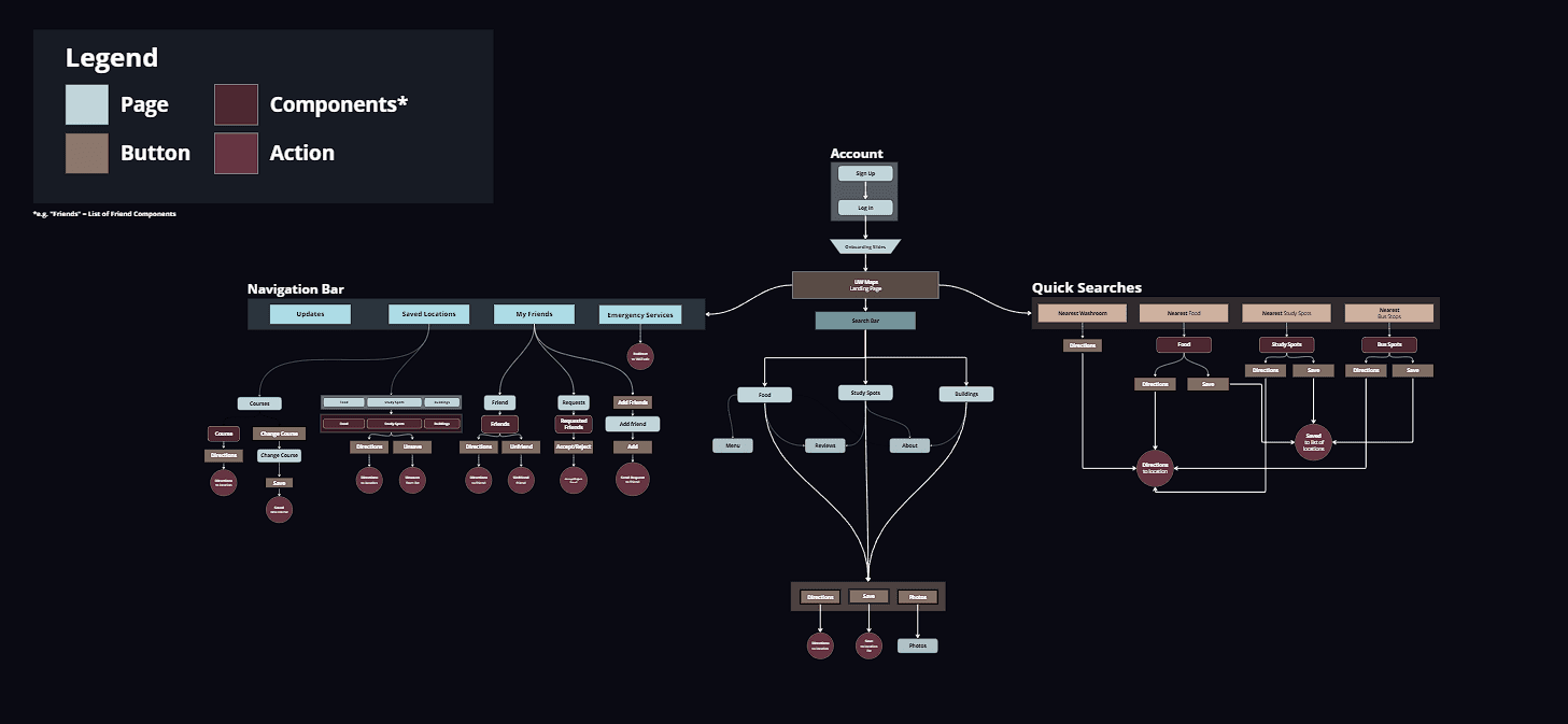
The next step involved establishing the information architecture of the app. In essence, this diagram provides a layout of where each page is located, aligning with the primary purposes outlined through user research. For a more detailed version, you can access the Miro board by clicking here.
Low & High-Fidelity Wireframes
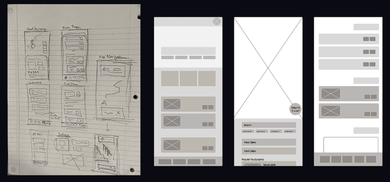
Time to actually start designing! To quickly visualize and have something tangible, I usually grab a piece of paper and start creating low-fidelity wireframes. For UW Maps, I started off by creating very basic sketches of each of the initial pages of all my navigation options.
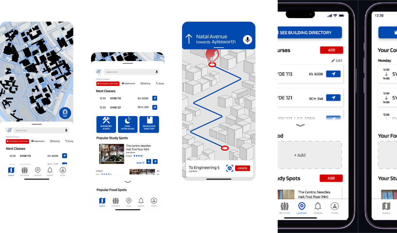
Then, I decided to make slightly higher fidelity wireframes of the saved locations and main explore tab. These are much easier to change and reiterate than actual designs.
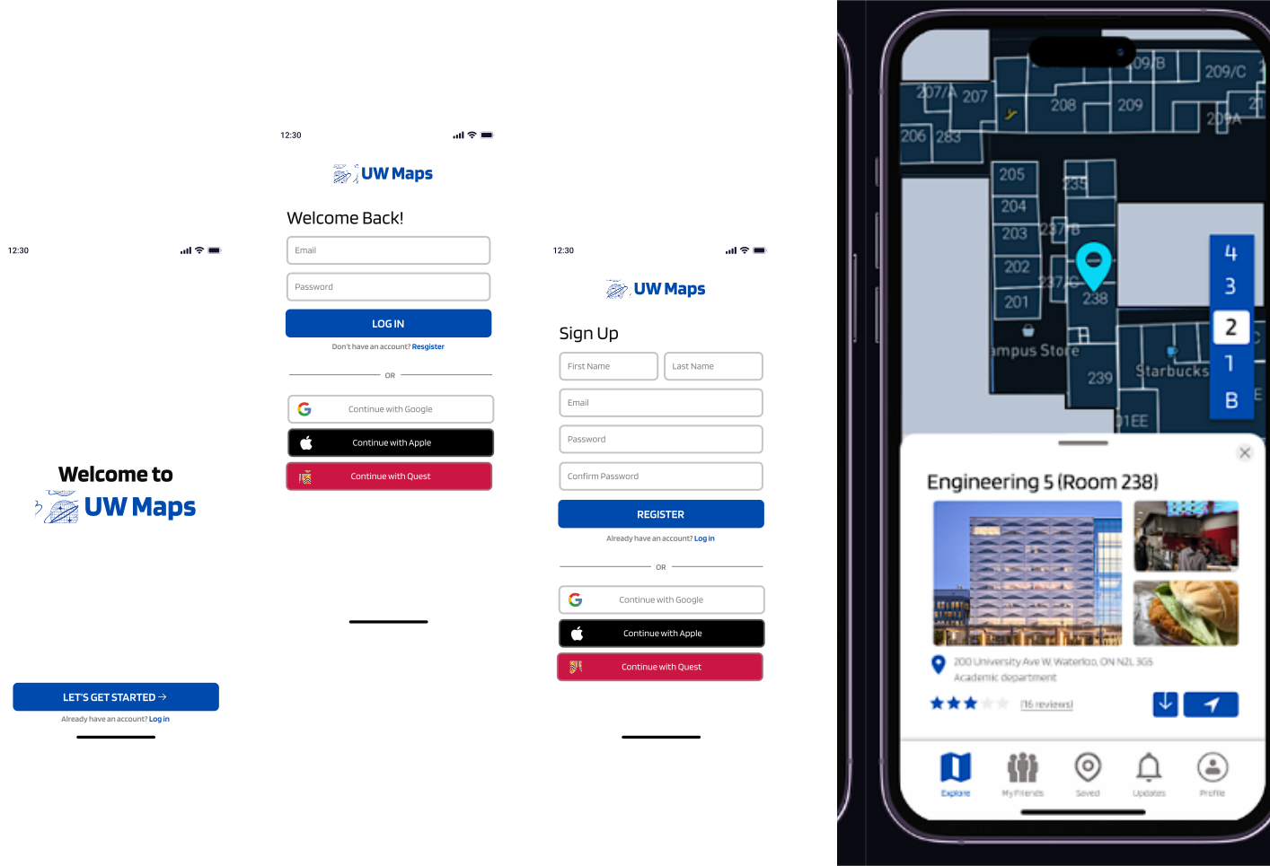
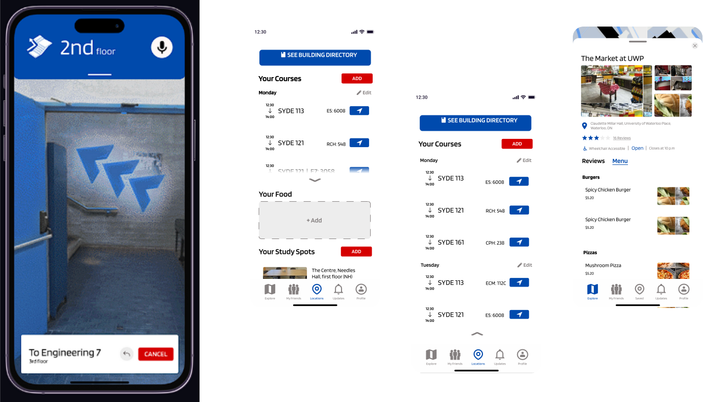
✨ 004 // Final Designs